Does reducing fees increase revenue: Metrics [6/7]
Posts in the series: Intro, 1/7: Context and TAM, 2/7: A conceptual model, 3/7: Externalities and breaking even, 4/7: Dynamics over time, 5/7: Testing approach, inferring results, next steps if test fails , 6/7: Metrics , 7/7: Takeaway, Google Sheets with data
Section 9: What Metrics should we track in an allotment change test?
It is important to carefully choose metrics: too few metrics and we may lack clarity on the impact of our test; too many and it becomes difficult to digest and take action on - we may end up being distracted by vanity metrics or noise.
One way to organize metrics might be to consider 1) success metrics 2) risk metrics 3) iteration metrics 4) mechanism metrics
Success metrics
Success metrics would map directly to the goals of our test. In this case, the primary goal of the test is monetization, a secondary goal is improving inventory selection and a third goal is retention (by offering sellers something they have expressed interest in).
The metrics related to the aforementioned goals are:
Monetization: 1) incremental revenue
Inventory selection: 2) incremental listings
Retention: 3) incremental seller churn (the goal being churn reduction)
Note incremental metrics are with respect to baseline of 20 free allotment level
Also note that often measurement is done only for “qualified users” i.e. the user group towards whom the treatment is targeted - Consumer sellers in our context-in order to improve measurement sensitivity. However given the large expected impact of Consumer sellers listing levels on the site, all sellers are expected to be affected. Therefore the success metrics and most of the metrics below are at an overall level instead of being restricted to Consumer sellers only.
Risk metrics
Next we look at the risk metrics that would give us indications of situations we would not want to occur, but think might happen. In this case, the risks are negative externalities in the form of store downgrades or negative flywheel effects.
The metrics to track these risks would be:
Negative externalities: 4) incremental basic store downgrades
Negative flywheel effect: 5) monthly incremental seller churn 6) monthly incremental buyer churn 7) monthly incremental listings 8) monthly incremental sold items 9) monthly ASP of incremental sold items
Note metrics 5 and 7 are simply monthly views of metrics 3 and 2 respectively.
Iteration metrics
The iteration metrics are metrics that can help execute on next steps if the current test fails. Referring to Section 8, the iteration metric for this test would be 10) Percentage of sellers who paid the same or more during the test period compared to the pre-test period.
Mechanism metrics
Finally we can take a look at the metrics which may offer insights into the factors and mechanisms that lead to success or risk metrics. Some caveats before delving into these metrics are a) These metrics may not always neatly build up to the top level success and risk metrics we are interested in explaining. A marketplace being a complex, as opposed to a complicated system has components that influence each other, due to which the sum may be greater than the parts. A reductive view into constituent elements may not carry sufficient explanatory power b) It may only be possible to tell whether the direction or size of the movement of a metric is good or bad post hoc. In absence of prior data or a business philosophy that may provide a framework for interpretation, it may not be possible to tell in real time if we are trending in a good or bad direction. A later example will make this point clearer c) It must also be mentioned that often the mechanism metrics will inform as opposed to enable us to take action. These will allow us to deepen our model of the marketplace and have data points to predict outcomes of future ideas. For instance let’s say the metrics tell us our tests did not generate incremental revenue because “search is broken” i.e. a massive influx of inventory made it difficult for users to find the right items. In this case, do we fix search in an attempt to get more incremental revenue or do we move on to a new monetization test? The metrics will not tell us which action is worth taking, but it will inform us of the state of the marketplace.
As mentioned before it generally is not a good idea to look at too many metrics but because in an expensive, long running, near sitewide test with many unknowns (such as what may trigger a negative flywheel) questions will inevitably come up and it is helpful to have the instrumentation, segmentation and data pipeline set up to easily be able to obtain these metrics. Even so, such low level metrics may be noisy and should be held to stricter statistical significance requirements e.g. p < 0.01
Now in context of this test, these lower level mechanism metrics would include:
For incremental revenue: 11) incremental sales fees 12) incremental listing fees 13) forgone basic store subscription fees
When trying to understand the mechanism of the flywheel, we may group the metrics by item level, user level and product level. This would allow us to know the kind of items we have lost or gained and the kind of buyers and sellers we have lost or gained as a result of the allotment change. Each group of metrics should reveal new information that is not disclosed by the other group. So for instance, if we already know the changes in category distribution from an item level view, it may not be especially insightful to look into change in sellers by category.
Item level metrics
In an item level view, we could track listings mix change by looking at the factors that inform buyers’ purchase decisions at the highest level and seeing how the distribution of those factors change over allotment levels and time.
Specifically, we may look at changes in the listing distribution over 14) categories, 15) item condition i.e. new vs. used 16) seller trust and 17) list price
For example, the category distribution for overall listings, across consumer and business sellers may change between 20 and 50 allotments as illustrated in the seasonality adjusted chart below. Note this seasonality adjusted chart has just one bar for the 20 allotment world, since it is expected to have reached steady state. In contrast the multiple bars for the 50 allotment world illustrate the impact of the flywheel.
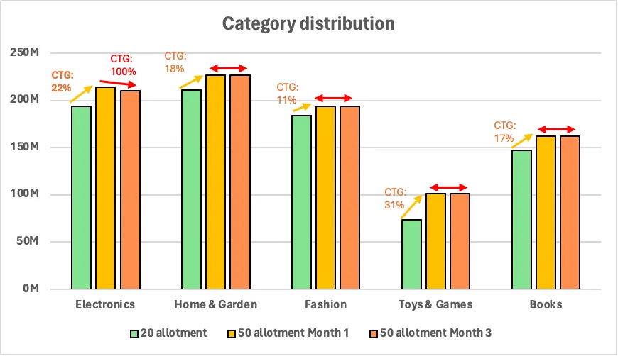
Chart : Listing changes over allotment and time viewed by category
In this example, most of the initial growth in incremental listings at 50 allotments happens for the Toys & Games category, accounting for 31% contribution to growth. This is followed by the Electronics category with 22% contribution to growth. Even though Toys & Games may have the most growth, category ranking remains unchanged between 20 and 50 allotments, meaning that in both scenarios Electronics is the largest category, followed by Fashion, followed by Home & Garden and then Toys & Games and then Books.
This example demonstrates one of the aforementioned caveats which suggested that it may not be possible to say whether the growth of a certain category i.e. Toys & Games in this case is good or bad without prior data or a business philosophy.
The example also illustrates changes over time. In this case, the entirety of the listings change between month 1 and month 3 is in the Electronics category, which experiences a less than 2% dip in listings. Even though the change is small, it may be impactful depending on the value (ASP, conversion propensity) of listings that were lost.
Another listings view we can look at is the item condition distribution. Again, in absence of a principle or experience in how item conditions may impact the state of the marketplace, we can only take note of how things are changing without being able to comment on whether it is good or bad.
For instance, a change such as below can only be noted as most of the listings growth in the 50 allotment world is coming through old items, however the new items continue to be in the lead for item distribution, followed by old and then refurbished. In the 3rd month after allotment change to 50, the entirety of the drop in listings is accounted for by new items.
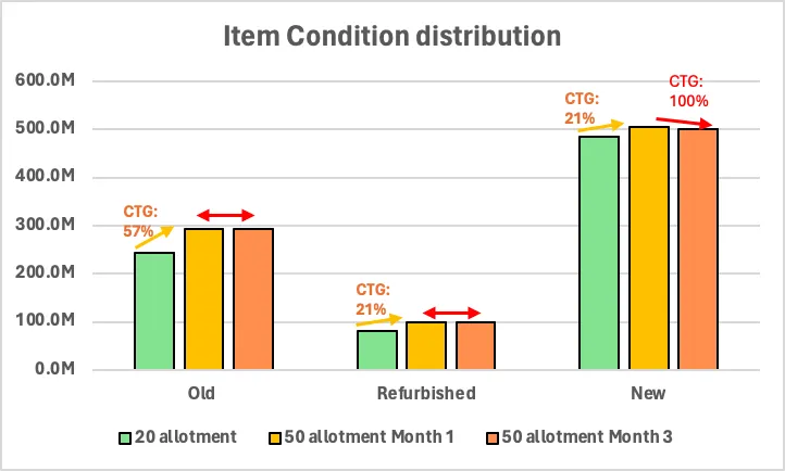
Chart 21: Listing changes over allotment and time viewed by item condition
The reason for discussing the above two views is to call out the fact that it is often the case that we may monitor how things are evolving but it may not be possible to say if the evolution is good or bad, or whether action needs to be taken with regards to the change. Being aware ahead of time that we may encounter such situations allows us to set expectations that data may not be able to give us the answers we seek-that we may have to come up with some heuristics for decision making, or we may have to wait and see how things pan out.
However there could be views that tell a cleaner story. For instance, we could perhaps find that the incremental listings entirely came from low trust sellers as in the chart below. From this we could infer that the likelihood of the listings being of lower quality and having lower conversion is high. Moreover we can see that the entirety of the listings drop of month 3 can be attributed to the sellers with the highest trust score, further emphasizing that the listings mix may be trending towards a less desirable direction.
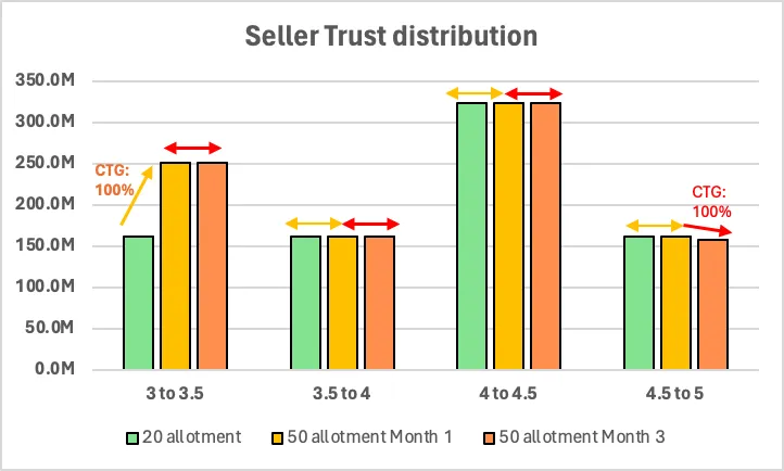
Chart 22: Listing changes over allotment and time viewed by seller trust
We could take a look at how list prices change over allotments. As in the charts below, it could be that compared to the 20 allotment world, the 50 allotment world has more lower priced listings in the first month. While compared to the first month, there are fewer higher priced listings in the third month.
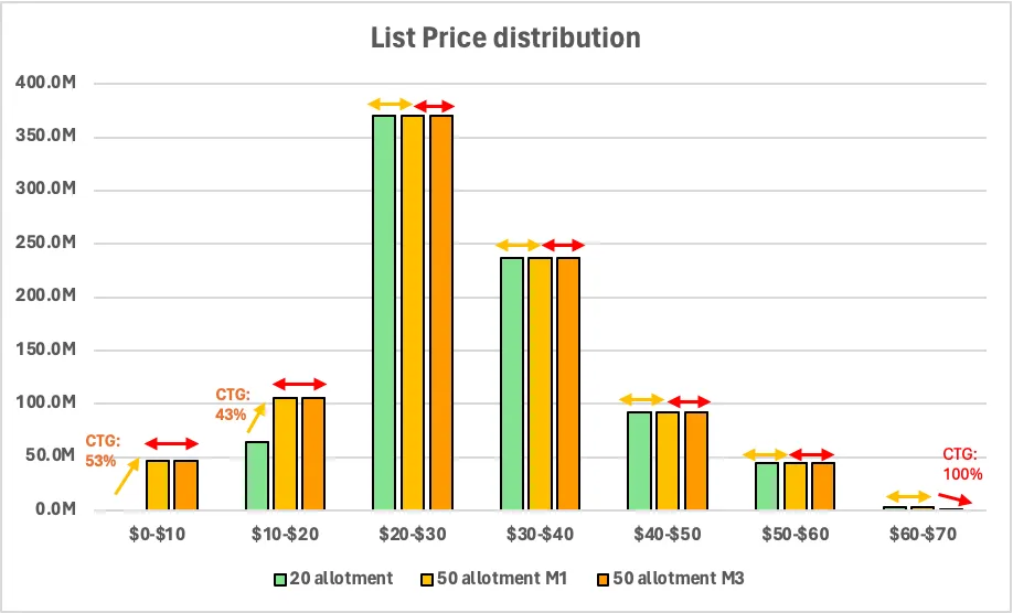
Chart 23: Listing changes over allotment and time viewed by list price
The simple summary of the listings view is that there was listings growth across all categories with the majority of it coming from Toys and Games; however the growth did not change the shape of the category distribution. Most of the listings skewed towards low priced, old items from low trust sellers.
Going further down the funnel on an item level view, we may also look at the distribution of sold items by 18) categories 19) item condition 20) seller trust 21) ASP and 22) time to sale. With the exception of the time to sale metric, all the others are a mapping of the listing distribution metrics we have just seen. Sample views of sold item distribution by item condition and time to sale metrics are shared below, to demonstrate how to present or interpret such data.
The first thing to observe from the sales distribution by category chart is that in the first month under 50 allotment world, there was an overall growth in sales and the majority of the growth came from the Electronics category. Even so, the sales growth did not keep up with the listings growth in Electronics as indicated by the 1pt drop in conversion from 30% to 29%. Home & Garden sales grew from 20 to 50 allotment, but conversion remained flat which means sales grew at the same rate as listings. This may indicate that sellers of this category had a good sense of their market and were effective at scaling their inventory. This is in contrast to Fashion sellers where there was no sales in growth but a drop in conversions, meaning none of the incremental listings sold. The remaining two categories experienced sales growth that was less than the listings growth.
The next thing to observe is that the sales in month 3 in the 50 allotment world is lower than that in month 1, entirely due to the Electronics category. However even with this drop, the sales in month 3 is still higher than in the 20 allotment world.
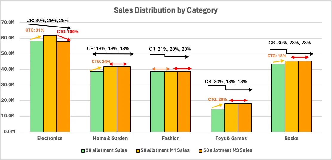
Chart 24: Sales changes over allotment and time viewed by category
In this hypothetical example of time to sales distribution, we see a clear shift in items selling within 2 weeks in the 20 allotment world to taking a month or longer to sell for those listed in the first month of the 50 allotment world. This trend exacerbates in the third month of the 50 allotment world. If such a pattern is observed, we can only say “what” is happening as opposed to “why”. We can make some guesses as to “why” but they will simply be guesses that would need to be validated. Some guesses as to why time to sale may increase are a) buyers cannot find the item they are looking for in the midst of too many items b) buyers are taking time to comparison shop now that they have options c) buyers are overwhelmed by the paradox of choice
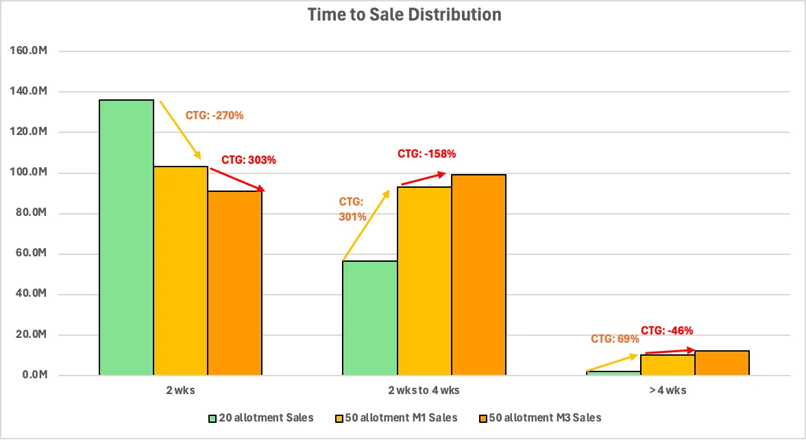
Chart 25: Time to sale changes over allotment and time
User level metrics
Next we can take a look at user level charts. We may categorize users into 4 types: listers, sellers, buyers and searchers. For simplicity however, we look at the listers at a higher level and only dig further into converting listers i.e. sellers.
So the metric we consider next is 23) listers vs. sellers distribution. In the hypothetical example shown in the chart below, in the first month of 50 allotments, listers and sellers level remains unchanged compared to the 20 allotment world. However in the third month, we see a drop in listers followed by a smaller drop in sellers, meaning converting and non converting listers had churned by the third month of the allotment change. This implies that the listings and sales growth we had seen in month 1 in the 50 allotment world from previous charts was due to existing listers and sellers successfully being able to list and sell; while the drop in listings and sales in month 3 was due to lister and seller churn as opposed to them scaling down.
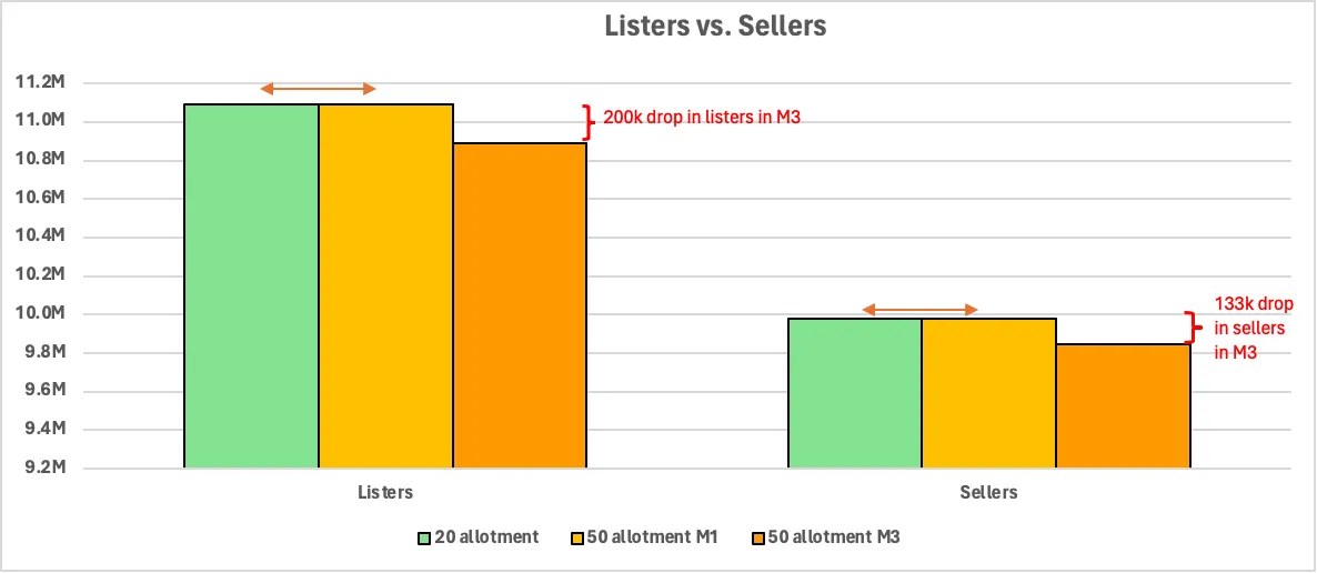
Chart 26: Lister and seller count changes over allotment and time
Now that we know how overall listers change, we can also take a look into 24) lister distribution by number of listings as in Chart 4 and 25) scaling patterns of listers as in Table 3
In order to understand any changes in converting listers i.e. sellers we look at 26) seller distribution by tiers. Per the sample chart below, we can say that the 133k drop in sellers in the third month is primarily driven by consumer sellers and to a small extent by Basic store sellers. Premium and Anchor store sellers did not experience any churn.
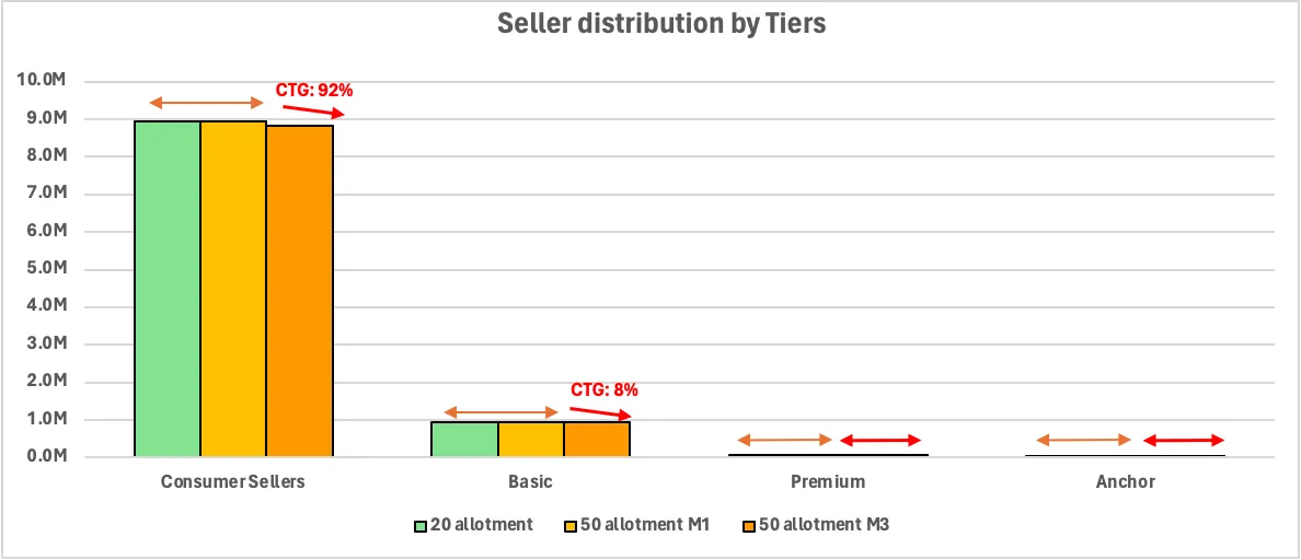
Chart 27: Seller changes over allotment and time viewed by seller tiers
We may further analyze seller movement by looking at seller attributes we value. For instance we may look at 27) sellers distributed by tenure as in the chart below to know whether we are losing newer sellers i.e. those of tenure of less than a year and may thus be risking growth or if we are losing older sellers i.e. those of tenure of more than two years and are thus hurting retention.
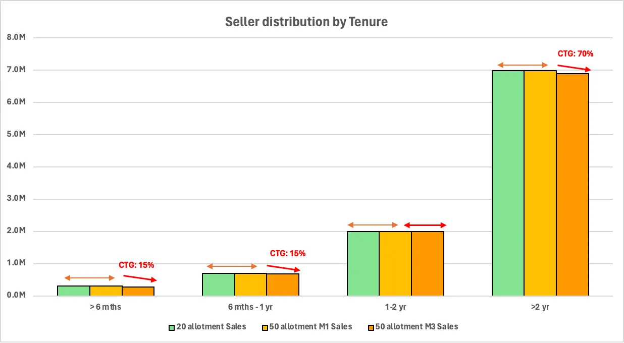
Chart 28: Seller changes over allotment and time viewed by seller tenure
Other seller distributions we may find useful to look at may be seller tier and tenure adjusted 28) GMV per seller 29) GMV growth per seller 30) buyers per seller and 31) frequency of sales per seller.
To concretize the idea of how these metrics may be presented, we consider the distribution of GMV per seller in the chart below. For this chart, we first group the sellers based on their tenure and tiers and within each group we sort the sellers based on their GMV in the 20 allotment world prior to the start of the test. Within each group, we separate the sellers into 3 quantiles: high, mid and low. These 3 quantiles constitute a new type of seller grouping that includes sellers of all tenure and tiers. Based on this new grouping, we track the count of the sellers in month 1 and month 3 under the 50 allotment world. In our hypothetical example, the distribution of GMV per seller remains unchanged in month 1 of the 50 allotment world. However in month 3, we see a drop in seller count where 2/3rds of the drop is accounted for by low GMV sellers and 1/3rd of the drop is due to churn of high GMV sellers.
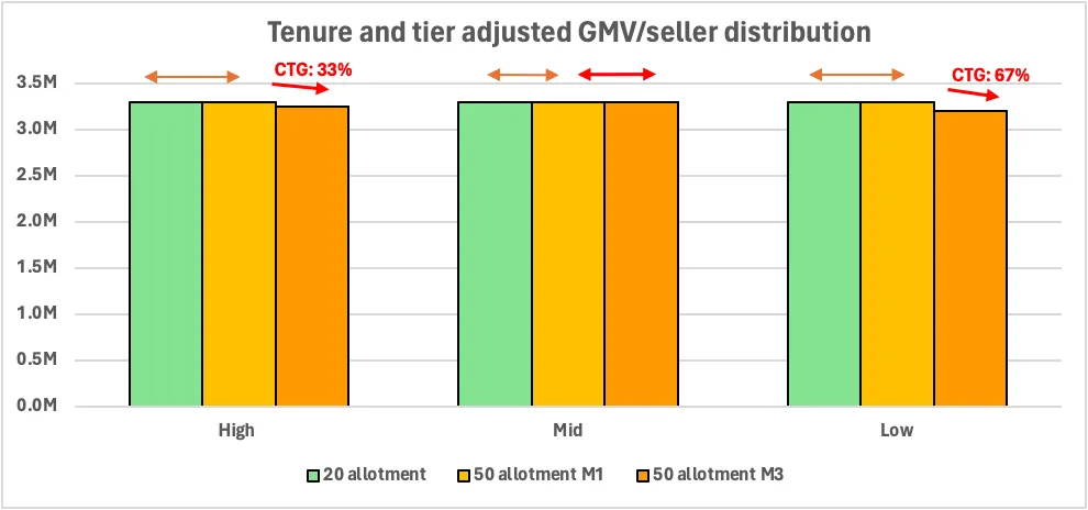
Chart 29: Tenure and tier adjusted GMV per seller changes over allotment and time
The low GMV sellers in the above chart may have high value in other dimensions such as GMV growth per seller. In preparing the chart that shows changes in the distribution of GMV growth per seller, we once again first group the sellers based on their tenure and tiers. This time however within each group we sort the sellers based on their seasonality adjusted monthly GMV growth in the 20 allotment world prior to the start of the test. After this, we remain consistent with the approach described in the previous example and obtain a new grouping of seller types based on high, mid and low GMV growth per seller and track them through months 1 to 3 under an allotment change. This results in a chart such as the one below which illustrates that the loss of sellers in month 3 is equally distributed across sellers of all growth levels. Relating this to the previous chart, a situation like this would mean that even when the majority of churned sellers have low GMV, a portion of them may still be mid to high growth sellers.
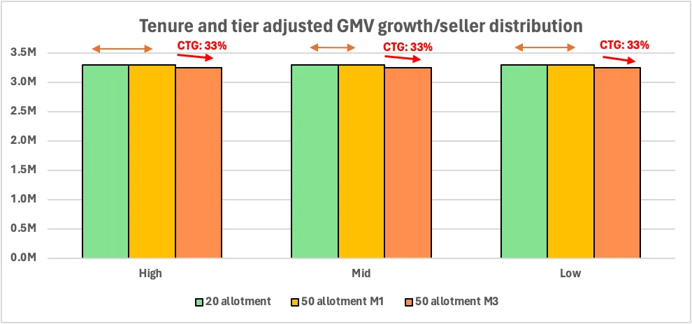
Chart 30: Tenure and tier adjusted GMV growth per seller changes over allotment and time
Similarly if we plot the tenure and tier adjusted buyers per seller chart, we might be interested in knowing if a significant chunk of churn is occurring from sellers who have a high number of buyers; or if we plot the tenure and tier adjusted frequency of sales per seller chart, we might be interested in knowing if churn is largely occurring for sellers who sell the most frequently.
Next we may plot a series of buyer related charts which can tell us about movements in the types of buyers we value. These charts would be mirrors of seller charts and so sample views of these charts are not provided here. But at a glance, metrics we might be interested in are 32) buyer count 33) buyers distributed by tenure, because we want to know if we are losing loyal, repeat customers 34) GMV per buyer because knowing if our GMV changes is influenced by a concentrated or distributed group may impact our options for action 35) sellers per buyer, because we want to know if many sellers will be impacted or not by the buyers who leave 36) frequency of purchase per buyer, because even if low GMV buyers leave the site, if they were frequent purchasers of low ASP items, cumulatively their absence may negatively impact sellers and therefore the marketplace
The last user level metrics we look at are 37) the number of searchers over allotments and time and 38) the number of searches per searcher over allotments and time. The former is a leading indicator of the level of demand in the marketplace. Relating the former to the number of buyers can tell us if a decrease in buyers for instance is due to lower traffic or lower conversion of traffic i.e. if we are dealing with an acquisition or activation problem. The latter may be a bit more of an ambiguous metric - searches per searcher may increase because users are interested in more items; however if searches per searcher increases following an inventory increase it is more likely because searchers cannot find what they are looking for.
Product level metrics
Finally the product metrics to consider over allotments, time and category would be 39) search to listings ratio 40) numbers of search refinements per search 41) pageviews per search and 42) % of converted searches.
An increase in search to listings ratio without an increase in listings would mean there is more demand than listings. However if the increase is because both listings and searches grew, but searches grew more then it may indicate either demand outstrips supply, or that items are harder to find.
An increase in the next metric i.e. number of search refinements per search helps validate whether items are getting harder to find. Generally refinements such as sorting and filtering are used more when the right item for the user is not at the top of the search results.
An increase in pageviews per search would indicate an increase in demand since it indicates users have moved further down the funnel in their search for items and specific items are catching their attention.
Lastly, an increase in % of converted searches, unless it is accompanied by a drop in searches, would mean more demand is being fulfilled. It would be an indication that sellers had scaled appropriately to meet demand.
Posts in the series: Intro, 1/7: Context and TAM, 2/7: A conceptual model, 3/7: Externalities and breaking even, 4/7: Dynamics over time, 5/7: Testing approach, inferring results, next steps if test fails , 6/7: Metrics , 7/7: Takeaway, Google Sheets with data